KAPDEC® | Elite STEM Learning Platform | https://kapdec.com
Unit: Exploring One – Variable Data
Chapter: Tables or Graph Representation & Interpreting statistics
Reference: – Data type, Frequency Distribution, Measures of center, Measures of spread, Box plots, Scatter plots, Correlation, Regression Analysis, Bar graph & Pie chart, two-way tables & Contingency tables, Probability & Normal Distribution, Confidence Intervals, Hypothesis Testing, Inference for Means & Proportion.
After studying this chapter, you should be able to understand:
- Measures of Center & Measures of Spread
- Two-way & Contingency tables.
- Probability & Normal Distribution
Top of Form
Measures of Center & Measures of Spread: –
- Data Distribution: Data distribution refers to the way data values are spread or distributed over a range of possible values. Understanding the data distribution is crucial in statistics because it helps us analyze the characteristics of the data and make informed decisions about it.
- Frequency Distribution: Frequency distribution is a table that shows the number of times each value or range of values occurs in a dataset. It provides a summary of the data distribution and helps identify patterns, central tendencies, and outliers.
- Histogram: A histogram is a graphical representation of the frequency distribution. It consists of bars, where the height of each bar represents the frequency of values falling within a specific range (bin). Histograms provide a visual depiction of the data distribution’s shape and help identify any skewness or symmetry.
- Symmetric Distribution: A symmetric distribution is one where the data is evenly distributed around the center, and the left and right halves of the distribution are roughly mirror images of each other. The mean, median, and mode are all the same in a perfectly symmetric distribution.
- Skewed Distribution: A skewed distribution is one where the data is not symmetric. It means that one tail of the distribution is longer or stretched compared to the other. There are two types of skewed distributions:
- Positively skewed (Right-skewed): The longer tail is on the right side, and the majority of data is on the left.
- Negatively skewed (Left-skewed): The longer tail is on the left side, and the majority of data is on the right.
- Central Tendency: Central tendency refers to the middle or central value around which the data tends to cluster. It provides a single representative value to summarize the entire dataset.
- Mean: The mean is the most common measure of central tendency. It is calculated by adding up all the values in the dataset and then dividing by the number of data points. The formula for the mean is:
Mean = (Sum of all values) / (Number of data points) - Median: The median is the middle value of a dataset when the data is arranged in ascending or descending order. If there is an even number of data points, the median is the average of the two middle values.
- Mode: The mode is the value that appears most frequently in a dataset. It can be more than one value (multimodal) or no mode at all (if all values are unique).
Relationship between Mean, Median, and Mode: In a symmetric distribution, the mean, median, and mode are approximately equal. However, in skewed distributions, they can differ significantly. For example:
-
- In a positively skewed distribution, the mean is usually larger than the median, which, in turn, is larger than the mode.
- In a negatively skewed distribution, the mean is usually smaller than the median, which, in turn, is smaller than the mode.
Measures of Spread:
- Range: The difference between the maximum and minimum values in a set of data. It provides a rough idea of how much the data values vary.
- Variance: A measure of the average squared deviation from the mean. It quantifies how much the data points deviate from the mean. Variance is calculated as the sum of squared differences between each data point and the mean, divided by the total number of data points (population variance) or by one less than the total number of data points (sample variance).
- Standard Deviation: The square root of the variance. It measures the dispersion or spread of data points around the mean. A smaller standard deviation indicates that the data is tightly clustered around the mean, while a larger standard deviation suggests more significant variability.
- Interquartile Range (IQR): The range of the middle 50% of data values. It is calculated as the difference between the third quartile (Q3) and the first quartile (Q1) and is less sensitive to extreme values than the range.
- Percentiles: Values that divide a set of data into 100 equal parts. The median is the 50th percentile, the first quartile (Q1) is the 25th percentile, and the third quartile (Q3) is the 75th percentile, etc.
- Box-and-Whisker Plot (Box Plot): A graphical representation of the five-number summary of data (minimum, Q1, median, Q3, maximum) that shows the spread and distribution of the data.
Top of Form
Probability & Normal Distribution
Probability:
- Probability Basics: Probability is a measure of the likelihood that an event will occur. It ranges from 0 (impossible event) to 1 (certain event). The sum of probabilities for all possible outcomes in a sample space is 1.
- Probability of Single Events: In simple cases, the probability of a single event is calculated as the number of favorable outcomes divided by the total number of possible outcomes.
- Complementary Events: The probability of an event occurring is equal to 1 minus the probability of its complementary event (the event not occurring).
- Addition Rule: When two events are mutually exclusive (cannot happen simultaneously), the probability of either event occurring is the sum of their individual probabilities.
- Multiplication Rule: When two events are independent (the occurrence of one event does not affect the occurrence of the other), the probability of both events occurring is the product of their individual probabilities.
- Conditional Probability: The probability of one event happening given that another event has occurred. It is calculated as the probability of the joint occurrence of both events divided by the probability of the given event.
- Probability Distributions: In AP Statistics, students will encounter discrete and continuous probability distributions, such as the binomial distribution, geometric distribution, and uniform distribution.
Normal Distribution:
- Normal Curve: The normal distribution, also known as the Gaussian distribution, is a continuous probability distribution that is symmetrical and bell-shaped. It is defined by its mean (μ) and standard deviation (σ).
- Standard Normal Distribution: A specific form of the normal distribution with a mean of 0 and a standard deviation of 1. Z-scores are used to standardize data to the standard normal distribution.
- Z-scores: Z-scores (also called standard scores) are used to measure how many standard deviations a data point is from the mean. Positive z-scores indicate values above the mean, while negative z-scores indicate values below the mean.
- Calculations with Normal Distribution: In AP Statistics, students will learn to calculate probabilities related to the normal distribution, such as finding the area under the curve for a given interval, finding probabilities for a specific value, and using z-scores to find percentiles.
- Central Limit Theorem: The central limit theorem states that the sampling distribution of the sample mean (or other statistics) will be approximately normally distributed, regardless of the shape of the population, as long as the sample size is sufficiently large.
Example:
Exam Scores
Suppose we have a class of 30 students, and their scores on a recent math exam are as follows:
85, 78, 92, 65, 80, 88, 75, 95, 70, 82, 90, 85, 72, 78, 84, 98, 88, 68, 75, 81, 87, 92, 79, 86, 80, 83, 89, 93, 77, 84
Solution: – Step 1: Constructing a Frequency Distribution
A frequency distribution table summarizes the data and shows the frequency (count) of each score. To construct a frequency distribution, follow these steps:
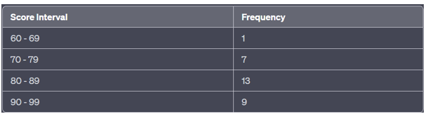
- Create “Score” intervals or categories (bins). For this example, we’ll group the scores into intervals of 10 points each:
- 60 – 69 (inclusive)
- 70 – 79 (inclusive)
- 80 – 89 (inclusive)
- 90 – 99 (inclusive)
- Count how many scores fall into each interval and record the frequencies:
Source: Kapdec.com
Step 2: Graph Representation
Now, let’s create a histogram to visually represent the frequency distribution.
- Draw a horizontal axis representing the score intervals and a vertical axis representing the frequencies.
- On the horizontal axis, label the score intervals: 60-69, 70-79, 80-89, 90-99.
- On the vertical axis, label the frequency from 0 to the highest frequency (in this case, 13).
- Create rectangles (bars) for each interval, with the height of each bar corresponding to the frequency of that interval.
Interpreting Statistics:
The histogram shows the distribution of exam scores. The majority of students scored in the range of 80-89, with 13 students falling into that interval.
There is one student who scored in the range of 60-69, seven students scored in the range of 70-79, and nine students scored in the range of 90-99.
The histogram helps us visualize the distribution and see the most common score range, as well as the spread of scores across different intervals.
Scan to visit this resource online
https://kapdec.com/resources/tables-or-graph-representation-interpreting-statistic
