KAPDEC® | Elite STEM Learning Platform | https://kapdec.com
Unit: Exploring One – Variable Data
Chapter: Categorical variation & Quantitative Variables
Reference: – Categorical Data, Frequency Tables, Bar Charts, Pie charts, Two-way tables, Conditional Distributions, Simpson’s Paradox, Quantitative data, Stem & Leaf plot’s, Histograms, Measure of central tendency, Measures of Variability, Box plots, Scatter plots
After studying this chapter, you should be able to:
- The fundamental concept of Categorical Data & Frequency tables.
- Types of Charts & Conditional Distribution.
- Simpson’s Paradox, Quantitative Data.
Fundamental Concept of Categorical Data
- Definition: Categorical data, also known as qualitative or nominal data, consists of observations that can be placed into distinct categories or groups. Each data point belongs to one of the predefined categories, and there is no inherent order or numerical value associated with these categories.
- Examples: Categorical data includes attributes like gender (male/female), eye color (blue/brown/green), marital status (single/married/divorced), education level (high school/college/graduate), and favorite color (red/blue/green, etc.).
- Types of Categorical Data: There are two main types of categorical data: a. Nominal Data: Represents categories without any natural order. For example, hair color or types of animals. b. Ordinal Data: Represents categories with a specific order but without fixed numerical values. For example, educational levels (high school < college < graduate).
- Frequency Tables: To organize categorical data, statisticians often use frequency tables. These tables display the categories and the frequency or count of occurrences of each category in the dataset.
- Bar Charts: A common way to visualize categorical data is through bar charts. In this graphical representation, the categories are shown on the horizontal axis, and the corresponding frequencies or proportions are represented by bars of varying lengths on the vertical axis.
- Pie Charts: Another way to display categorical data is using pie charts. In a pie chart, each category is represented as a slice of the pie, with the size of the slice corresponding to the proportion of data in that category.
- Two-Way Tables: When dealing with two categorical variables, a two-way table (also known as a contingency table) is used to show how the categories of one variable are distributed across the categories of another variable. It is useful for exploring relationships between the two categorical variables.
- Conditional Distributions: In some cases, you may want to analyze the distribution of one categorical variable based on the condition of another categorical variable. This is known as a conditional distribution and is often presented in the form of a percentage or proportion.
Frequency Table in AP Statistics
- Definition: A frequency table is a way to organize and summarize categorical or quantitative data by displaying the number of occurrences (frequency) of each unique data point or category in a dataset.
- Categorical Data: In the context of categorical data, a frequency table lists all the distinct categories in the dataset and shows the count (or frequency) of each category. It helps to provide a clear picture of how the data is distributed across different categories.
- Quantitative Data: For quantitative data, a frequency table divides the data into intervals or bins and displays the number of data points that fall into each interval. This helps to understand the distribution and spread of the data.
- Construction: To create a frequency table for categorical data, follow these steps: a. List all the distinct categories or data points. b. Count the number of occurrences of each category in the dataset. c. Display the categories and their corresponding frequencies in a tabular format.
- Grouped Frequency Table: For quantitative data, especially when dealing with large datasets or a wide range of values, it is common to use a grouped frequency table. In a grouped frequency table, the data is grouped into intervals (bins), and the frequency of each interval is displayed.
- Example – Categorical Data: Consider a survey where respondents were asked about their favorite color, and the data collected is as follows:
- Red: 15
- Blue: 20
- Green: 12
- Yellow: 7
The frequency table for this categorical data would look like this:
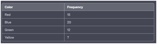
Source: Kapdec.com
Example – Quantitative Data: Suppose we have the following dataset representing the ages of a group of people:
25, 30, 35, 40, 42, 28, 35, 38, 27, 31
- To create a frequency table for this quantitative data, we first decide on the intervals (bins) and then count the number of data points falling into each interval:
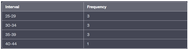
Source: Kapdec.com
- Usefulness: Frequency tables are helpful in summarizing data and gaining insights into its distribution. They are often used as a precursor to constructing visual representations like bar charts or histograms for better data visualization and analysis.
- Relative Frequencies: In addition to absolute frequencies, relative frequencies (proportions or percentages) can also be included in the frequency table. This allows for a better understanding of the proportion of each category or interval in the dataset relative to the whole.
Types of Charts: –
- Bar Charts:
- Bar charts are used to display and compare the frequency or proportion of different categories in categorical data.
- Each category is represented by a rectangular bar whose length is proportional to the frequency or proportion it represents.
- The bars are typically arranged along the horizontal or vertical axis.
- Histograms:
- Histograms are graphical representations used to visualize the distribution of quantitative data.
- The data is grouped into intervals (bins), and the height of each bar represents the frequency or count of data points falling within that interval.
- Histograms help identify the shape of the data distribution, its central tendency, and its variability.
- Pie Charts:
- Pie charts are circular graphs used to represent the proportions of different categories in a dataset.
- Each category is represented as a slice of the pie, and the size of the slice corresponds to the proportion it represents.
- Pie charts are suitable for displaying relative frequencies when there are a small number of categories.
- Scatterplots:
- Scatterplots are used to visualize the relationship between two quantitative variables.
- Each data point is represented by a point on a Cartesian plane, where one variable is plotted on the x-axis and the other on the y-axis.
- Scatterplots help identify patterns, correlations, and potential associations between the variables.
- Line Graphs:
- Line graphs are used to display the relationship between two quantitative variables over time or a continuous scale.
- Data points are connected with lines, which allows for a visual representation of trends and changes over the range of the variables.
- Box Plots (Box-and-Whisker Plots):
- Box plots provide a visual summary of the distribution of quantitative data through quartiles, the median, and potential outliers.
- The box represents the interquartile range (IQR), while the whiskers extend to the minimum and maximum non-outlier data points within a specified range.
- Stem-and-Leaf Plots:
- Stem-and-leaf plots are used to display the distribution of quantitative data.
- Data points are divided into stems (leading digits) and leaves (trailing digits), which allows for a compact representation of the data.
- Time Series Plots:
- Time series plots are used to visualize data collected over a period of time.
- The x-axis represents time, while the y-axis displays the corresponding values or measurements.
- Two-Way Tables:
- Two-way tables, also known as contingency tables, are used to display the relationship between two categorical variables.
- The table shows the frequencies or counts for each combination of categories in the two variables.
These charts are essential tools for understanding and interpreting data in AP Statistics. By using the appropriate chart type, statisticians can gain insights, identify patterns, and communicate results effectively.
Top of Form
Example:
Suppose a survey was conducted to gather information about the favorite genres of movies among a group of 100 individuals. The survey respondents could choose one of the following genres: Action, Comedy, Drama, Sci-Fi, and Romance.
The data collected is as follows:
- Action: 25 respondents
- Comedy: 18 respondents
- Drama: 30 respondents
- Sci-Fi: 15 respondents
- Romance: 12 respondents
We will use this data to create a frequency table and a bar chart to visualize the distribution of favorite movie genres.
Solution: – Step 1: Constructing the Frequency Table
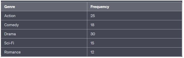
Source: Kapdec.com
Step 2: Constructing the Bar Chart
In the bar chart, we represent each genre on the x-axis and the corresponding frequency on the y-axis. The height of each bar corresponds to the frequency of each genre.
(Note: The following chart is a simple representation. In practice, the chart would have proper labelling, axis titles, and styling.)
Step 3: Analyzing the Results
From the frequency table and bar chart, we can observe the following insights:
- The most preferred genre among the respondents is Drama, with 30 individuals selecting it as their favorite genre.
- The least preferred genre is Romance, with only 12 respondents choosing it.
- Action and Drama are relatively popular genres, while Sci-Fi and Romance have fewer fans in this group.
Key Points
- Categorical variation deals with data that falls into distinct categories or groups, and each data point belongs to one of these predefined categories.
- Categorical data can be further classified into nominal data (no inherent order) and ordinal data (with a specific order but no fixed numerical values).
- Frequency tables are used to organize categorical data, displaying the frequency or count of each category.
- Bar charts and pie charts are common graphical representations of categorical data, illustrating the distribution and proportion of each category.
- Two-way tables, also known as contingency tables, are used to analyze the relationship between two categorical variables, showing frequencies for each combination of categories.
- Conditional distributions help analyze a categorical variable based on the condition of another categorical variable.
- Simpson’s Paradox is a phenomenon in which the conclusion of an apparent relationship between variables is reversed or altered when a confounding variable is considered.
- Quantitative variables represent numerical data that can be measured on a continuous scale, such as height, weight, temperature, or income.
- Stem-and-leaf plots and histograms are used to visualize the distribution of quantitative data, highlighting the shape, center, and spread of the data.
- Measures of central tendency, such as the mean, median, and mode, are used to describe the center of a dataset.
- Measures of variability, including the range, variance, and standard deviation, provide insights into the spread or dispersion of the data.
- Box plots (box-and-whisker plots) display the five-number summary of a dataset, including the minimum, lower quartile, median, upper quartile, and maximum.
- Scatterplots help visualize the relationship between two quantitative variables, allowing the identification of patterns and correlations.
- Time series plots are useful for displaying data collected over time, such as tracking sales or stock prices.
- Context and interpretation are critical when analyzing both categorical and quantitative data. Understanding the nature of the data, potential sources of bias, and the limitations of the analysis is essential for drawing meaningful conclusions.
Scan to visit this resource online
https://kapdec.com/resources/categorical-variation-quantitative-variables
