KAPDEC® | Elite STEM Learning Platform | https://kapdec.com
Unit: Data Handling and Analysis
Chapter: Bivariate Data & Scatter Plots
Reference: – Introduction to Bivariate Data, Types of Relationships in Bivariate Data, Introduction to Scatter Plots, Interpreting Scatter Plots, Line of Best Fit (Trend Line), Correlation and Causation, Calculating and Understanding Correlation Coefficient, Applications of Bivariate Data and Scatter Plots
After studying this chapter, you should be able to understand:
- Introduction to Bivariate Data & Types of Relationships in Bivariate Data
- Interpreting Scatter Plots & Line of Best Fit (Trend Line)
- Correlation and Causation
- Applications of Bivariate Data and Scatter Plots
1. Introduction to Bivariate Data
- Bivariate data involves two variables that are analysed together to determine relationships or patterns.
- Unlike univariate data, which focuses on a single variable, bivariate data examines how two variables interact.
- It is commonly used in statistics and research to explore connections between different factors, such as height and weight, or study hours and test scores.
2. Types of Relationships in Bivariate Data
- The relationship between two variables can be classified as positive, negative, or no correlation based on how one variable affects the other.
- A positive correlation means that as one variable increases, the other also increases.
- A negative correlation means that as one variable increases, the other decreases.
- If the variables have no correlation, their values do not show any meaningful connection.
- Relationships can be either linear, where data points align along a straight path, or nonlinear, where patterns form curves or irregular trends.
3. Introduction to Scatter Plots
- A scatter plot is a graphical representation of bivariate data, where each point represents the values of two variables.
- The horizontal axis represents one variable, while the vertical axis represents the second variable.
- Scatter plots help in identifying trends, relationships, and outliers in a dataset.
- They are widely used in scientific studies, business analytics, and social sciences to visualize data patterns.
4. Interpreting Scatter Plots
- The arrangement of points on a scatter plot determines the nature of the relationship between variables.
- If the points form an upward-sloping pattern, the relationship is positive; if they slope downward, the relationship is negative.
- If the points are widely scattered without a clear pattern, it indicates no correlation.
- Clusters of points suggest data groupings, while outliers represent values that significantly deviate from the general trend.
5. Line of Best Fit (Trend Line)
- The line of best fit, also known as the trend line, represents the general direction of the data points.
- It helps in making predictions based on observed data by showing the overall trend.
- The accuracy of a trend line depends on how well it aligns with the scattered data points.
- In cases where data follows a linear pattern, the trend line serves as a useful tool for forecasting and decision-making.
6. Correlation and Causation
- Correlation refers to a statistical relationship between two variables, while causation means that one variable directly affects the other.
- A strong correlation between two variables does not necessarily imply a cause-and-effect relationship.
- External factors or hidden variables might influence both variables, creating an illusion of direct causation.
- Understanding the distinction between correlation and causation is crucial in scientific research and decision-making to avoid misleading conclusions.
7. Calculating and Understanding Correlation Coefficient
- The correlation coefficient is a measure that indicates the strength and direction of a relationship between two variables.
- It helps in determining whether the relationship is strong or weak and whether it is positive or negative.
- A strong correlation suggests a reliable connection, while a weak correlation implies a loose or uncertain relationship.
- The correlation coefficient is useful in fields like finance, medicine, and education to evaluate trends and dependencies.
8. Applications of Bivariate Data and Scatter Plots
- Bivariate data analysis is used in real-world applications, including market research, healthcare studies, and social sciences.
- In economics, it helps in analysing the relationship between factors such as income and spending habits.
- In medicine, researchers use scatter plots to study the connection between lifestyle choices and health outcomes.
- Business analysts use scatter plots to predict customer behavior and sales trends based on past data.
- These applications highlight the importance of bivariate data in understanding and interpreting complex relationships.
Example: –
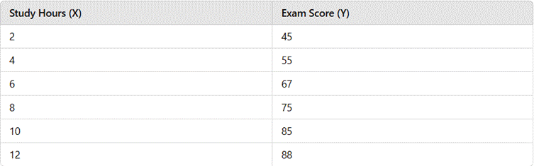
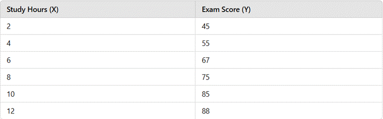
A school collects data to examine the relationship between study hours and exam scores for 6 students
Source: Kapdec.com
Solution: –
The given data represents bivariate data, where study hours (X) and exam scores (Y) are two related variables.
Step 1: Organizing the Data into a Table
Source: Kapdec.com
Step 2: Creating a Scatter Plot
- Each pair (X, Y) is plotted on a graph, with study hours on the X-axis and exam scores on the Y-axis.
- The plot shows an upward trend, indicating a positive correlation.
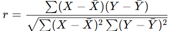
Step 3: Calculating the Correlation Coefficient (r)
Using the Pearson correlation formula:
Source: Kapdec.com
For this dataset, r ≈ 0.95, indicating a strong positive correlation between study hours and exam scores.
Step 5: Interpretation and Conclusion
- The strong correlation suggests that increasing study time leads to higher exam scores.
- The trend line can help predict scores for different study hours.
- Real-World Application: Educators can use this model to guide students in effective study planning.
Here are five conclusive points for the topic “Bivariate Data & Scatter Plots”
1. Bivariate Data Helps in Understanding Relationships
- The study of bivariate data enables us to analyse how two variables interact and whether they have a meaningful relationship.
- It helps in identifying patterns, trends, and possible connections between different factors in real-world scenarios.
2. Scatter Plots Provide a Visual Representation of Data Trends
- Scatter plots are an effective tool for visually interpreting data by showing how two variables relate to each other.
- The distribution of points on the graph helps in determining the nature and strength of the correlation.
3. Correlation Does Not Always Mean Causation
- While correlation indicates an association between two variables, it does not imply a direct cause-and-effect relationship.
- Other external factors may influence both variables, leading to misleading conclusions if not analysed carefully.
4. The Line of Best Fit Helps in Predicting Future Trends
- A trend line, or line of best fit, provides a general direction for data and aids in making predictions based on observed patterns.
- It is commonly used in business, economics, and science to forecast outcomes and make data-driven decisions.
5. Bivariate Data Analysis Has Wide Real-World Applications
- The study of bivariate data is crucial in fields such as finance, healthcare, marketing, and research.
- It helps businesses understand customer behavior, medical professionals analyse health trends, and scientists evaluate experimental results.
