Unit: Exploring Two – Variable Data
Chapter: Bivariate quantitative data using scatter plots
Reference: – Scatter plot construction, Correlation, Best fit line, Regression line, Strength of relationship, outliers, Causation, Residual plots, Influential points, Transformation, Interpreting scatter plots
After studying this chapter, you should be able to:
- Introduction to Scatter plot construction, Correlation.
- Regression line & Strength of Relationship.
- Outliers, Causation & Residual Plots.
- Influential Points & Interpretation
Introduction to Scatter plot Construction
- Definition:
-
- Scatter plots are an essential tool in exploratory data analysis, helping to reveal patterns and relationships between variables.
- They are particularly useful for identifying potential outliers, clusters, and trends within data.
- Different patterns in scatter plots include positive correlation (as one variable increases, the other tends to increase), negative correlation (as one variable increases, the other tends to decrease), and no correlation.
- Correlation:
- The correlation coefficient "r" quantifies the degree of linear association between two variables.
- A positive correlation means that as one variable increases, the other tends to increase.
- A negative correlation means that as one variable increases, the other tends to decrease.
- A correlation close to 0 indicates a weak linear relationship, while values closer to -1 or 1 indicate stronger relationships.
- Line of Best Fit (Regression Line):
- The line of best fit minimizes the sum of the squared vertical distances (residuals) between data points and the line.
- The slope "m" represents the rate of change of the dependent variable (y) with respect to the independent variable (x).
- The y-intercept "b" is the predicted value of y when x is 0.
- The equation of the line (y = mx + b) can be used for prediction and inference.
- Strength of Relationship:
- The spread of data points around the line of best fit provides insight into the strength of the linear relationship.
- A narrow spread indicates a strong relationship, while a wider spread suggests a weaker correlation.
- Outliers:
- Outliers can significantly impact the correlation coefficient and the line of best fit.
- It's important to investigate the reasons for outliers and consider whether they should be included in the analysis or treated separately.
- Causation vs. Correlation:
- While correlation indicates a statistical association, it does not establish causation.
- Spurious correlations, where variables appear to be related but are not causally linked, can occur.
- Residual Plots:
- Definition: A residual plot is a graphical representation of the differences (residuals) between observed data points and the predicted values from a statistical model, usually a regression line.
- Purpose: Residual plots help assess the goodness of fit of a model by examining the patterns of residuals. They provide insight into how well the model captures the variability in the data.
- Randomness: In a well-fitted model, the residuals should be randomly scattered around zero. A random pattern indicates that the model's assumptions are met and that the model is appropriate.
- Heteroscedasticity: If the spread of residuals changes as the values of the predictor variable change, it indicates heteroscedasticity. Heteroscedasticity suggests that the variability of the residuals is not constant across all levels of the predictor.
- Homoscedasticity: When the spread of residuals is roughly constant across all levels of the predictor variable, it indicates homoscedasticity. This is a desirable property for a regression model.
- Curvature: Non-linear patterns in the residual plot suggest that a linear model might not be appropriate. In such cases, a non-linear model or transformations may be needed.
- Fan-Shaped Pattern: A fan-shaped pattern in a residual plot often indicates heteroscedasticity, which might suggest the presence of unequal variances or other issues in the model.
- Influential Points:
- Definition: Influential points are individual data points that have a substantial impact on the results of a statistical analysis, such as the slope, intercept, and overall fit of a regression model.
- Leverage: Leverage refers to how much an individual data point can pull the regression line towards itself. Points with high leverage have extreme x-values and can significantly affect the slope of the line.
- Outliers vs. Influential Points: While outliers are data points far from the main cluster, influential points can be both outliers and non-outliers. Influential points can exert considerable influence on the regression line, even if they are not far from the main cluster.
- Cook's Distance: Cook's distance is a measure used to identify influential points in regression analysis. Points with high Cook's distance have a substantial impact on the model's fit.
- Highly Influential Points: Points with both high leverage and high residual values tend to be highly influential. These points can disproportionately affect regression coefficients and the overall model.
- Impact on Line: Influential points can alter the slope, intercept, and overall fit of the regression line. They can also affect statistical significance and confidence intervals.
- Detection and Treatment: Influential points should be carefully examined to determine their impact. In some cases, they might be influential due to genuine reasons, while in other cases, they could be data entry errors or anomalies.
- Robustness: Robust regression techniques, such as resistant regression or weighted least squares, can be used to mitigate the impact of influential points and outliers on the model's estimates.
- Transformations:
- Non-linear relationships can be transformed to linear relationships by applying mathematical functions to the data.
- Common transformations include taking the logarithm, square root, or reciprocal of the data.
- Interpreting Scatter Plots:
- When interpreting scatter plots, consider the context of the data and the implications of the correlation and regression line for real-world scenarios.
- Use scatter plots to identify trends, make predictions, and support statistical conclusions.
Residual Plots and Influential Points
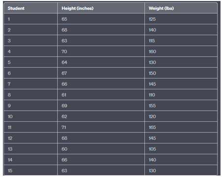
Example: Heights and Weights of Students
Suppose you are conducting a study on the relationship between the heights and weights of a group of students. You have collected data from a sample of 15 students. Here's the data:
Solution: – Step 1: Create a Scatter Plot
- Plot the height (x-axis) against the weight (y-axis) for each student.
- Each student's data point represents their height and weight.
Step 2: Calculate the Correlation
- Use a calculator or statistical software to calculate the correlation coefficient (Pearson's "r") between height and weight.
Step 3: Fit the Line of Best Fit (Regression Line)
- Determine the equation of the line that best fits the data. The equation is y = mx + b, where "m" is the slope and "b" is the y-intercept.
- Calculate the slope "m" and y-intercept "b" using the formulas:
- Examine the scatter plot for patterns. Does it show a positive, negative, or no linear relationship between height and weight?
- Interpret the correlation coefficient "r." A positive "r" indicates a positive linear relationship, a negative "r" indicates a negative linear relationship, and an "r" close to 0 indicates a weak or no linear relationship.
Step 5: Make Predictions
- Use the equation of the line of best fit to make predictions. For example, you can predict the weight of a student based on their height or vice versa.
Step 6: Assess Residuals and Influential Points (Optional)
- If desired, create a residual plot to assess how well the line of best fit fits the data.
- Identify any influential points that might be affecting the model's results.
Key Points
Scatter Plot Basics:
- Data Representation: Scatter plots visually display two quantitative variables on a coordinate plane, with one variable on the x-axis and the other on the y-axis.
- Variable Roles: The variable plotted on the x-axis is the independent variable, while the variable on the y-axis is the dependent variable.
- Patterns and Relationships: Scatter plots help identify patterns, trends, associations, and potential relationships between the two variables.
- Positive Correlation: A positive correlation indicates that as one variable increases, the other tends to increase.
- Negative Correlation: A negative correlation indicates that as one variable increases, the other tends to decrease.
- No Correlation: When data points appear scattered without a clear pattern, there may be little to no correlation between the variables.
Correlation and Interpretation:
- Correlation Coefficient (r): The correlation coefficient quantifies the strength and direction of a linear relationship between the variables. It ranges from -1 to 1.
- Interpretation of r: Positive r values imply a positive linear relationship, negative r values imply a negative linear relationship, and r close to 0 indicates weak correlation.
- Strength of Correlation: The closer the absolute value of r is to 1, the stronger the linear relationship.
- Outliers and Influential Points: Outliers and influential points can impact the correlation coefficient and the line of best fit.
- Scatter Plot Shape: The shape of a scatter plot can be linear, quadratic, exponential, logarithmic, or other functional forms.
Line of Best Fit and Regression:
- Line of Best Fit: The line that best summarizes the overall trend in a scatter plot is called the line of best fit or regression line.
- Equation of the Line: The equation y = mx + b represents the regression line, where "m" is the slope and "b" is the y-intercept.
- Calculating Slope and Intercept: Slope (m) and intercept (b) can be calculated using formulas involving sums of squares and products of data values.
- Residuals: Residuals are the vertical differences between observed data points and their corresponding points on the regression line.
- Residual Plot: A residual plot shows residuals on the y-axis and the independent variable on the x-axis. It helps assess the fit of the model.
Interpretation and Applications:
- Predictions: The regression line can be used to predict the dependent variable's value for a given independent variable's value.
- Causation vs. Correlation: A correlation between variables does not imply causation. Further investigation is needed to establish a causal relationship.
- Transformations: Transformations can help linearize non-linear relationships, making them suitable for regression analysis.
- Real-world Interpretation: When presenting results, explain the relationship between the variables in the context of the problem domain, accounting for the correlation, regression line, and potential sources of variation.