Unit: Exploring One – Variable Data
Chapter: Graphical Representation – Bar Chart
Reference: – Data type, Frequency Distribution, Measures of center, Measures of spread, Box plots, Scatter plots, Correlation, Regression Analysis, Bar graph & Pie chart, two-way tables & Contingency tables, Probability & Normal Distribution, Confidence Intervals, Hypothesis Testing, Inference for Means & Proportion.
After studying this chapter, you should be able to understand:
- Measures of Center & Measures of Spread
- Two-way & Contingency tables.
- Probability & Normal Distribution
Introduction to Bar Charts
A bar chart, also known as a bar graph, is a popular method for visually representing categorical data using bars of varying heights or lengths. The height (or length) of each bar represents the frequency or proportion of that category in the dataset.
Bar charts are one of the simplest and most effective ways to compare data across different categories and recognize patterns or trends.
Understanding Categorical Data
A bar chart is used for categorical data, meaning data that is divided into distinct categories or groups. Examples include:
- Favorite colors (Red, Blue, Green, etc.)
- Types of transport (Bus, Car, Train, Bike, etc.)
- Different brands of mobile phones (Apple, Samsung, OnePlus, etc.)
- Voting preferences in an election (Candidate A, Candidate B, etc.)
Since categorical data does not have a natural numerical order, a bar chart helps visualize differences between the categories effectively.
Types of Bar Charts
There are different types of bar charts, each useful for specific types of data representation:
1. Vertical Bar Chart (Column Chart)
- The most common type of bar chart.
- Bars are displayed vertically.
- The X-axis represents categories, while the Y-axis represents frequency or count.
- Example: The number of students preferring different school subjects.
2. Horizontal Bar Chart
- Bars are displayed horizontally instead of vertically.
- Used when category labels are long and difficult to read in a vertical chart.
- Example: The number of employees in different departments of a company.
3. Grouped Bar Chart (Clustered Bar Chart)
- Used to compare multiple categories within the same dataset.
- Multiple bars are placed side by side for different subcategories.
- Example: Comparing test scores of boys and girls in different subjects.
4. Stacked Bar Chart
- Bars are stacked on top of each other to show the total frequency while also displaying subcategories as segments within each bar.
- Useful for showing part-to-whole relationships.
- Example: Total sales of a company across different regions, with each bar divided into subcategories for online and offline sales.
Key Features of a Bar Chart
A well-structured bar chart has the following elements:
1. Title
- Clearly states the topic of the chart.
- Example: “Favorite Ice Cream Flavors Among Students.”
2. Axes Labels
- X-axis (Horizontal axis): Represents the categories of the data.
- Y-axis (Vertical axis): Represents the frequency (or percentage) of each category.
3. Bars
- Each bar represents a category, and its height (or length) corresponds to its frequency.
- Bars should be of equal width and spaced evenly apart.
4. Scale
- The Y-axis should have an appropriate scale to ensure accurate data representation.
- Example: If the highest frequency is 50, the Y-axis scale can be set at intervals of 10 (0, 10, 20, 30, 40, 50).
Steps to Create a Bar Chart
Let’s take an example where a teacher surveys students about their favorite school subjects. The responses are recorded as follows:
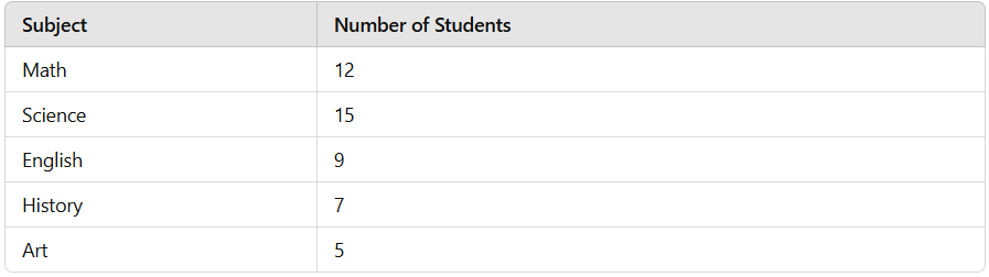
Step 1: Draw the Axes
- Draw a horizontal axis (X-axis) and label it with the different subjects: Math, Science, English, History, and Art.
- Draw a vertical axis (Y-axis) and label it with the frequency (number of students).
Step 2: Set the Scale
- Determine the highest value (15 students for science).
- Choose a scale that covers the range (for example, intervals of 5: 0, 5, 10, 15).
Step 3: Draw Bars
- Draw bars for each subject.
- Ensure that bars are evenly spaced and proportional to the frequencies.
Step 4: Interpret the Bar Chart
- The tallest bar (Science – 15 students) represents the most preferred subject.
- The shortest bar (Art – 5 students) represents the least preferred subject.
- The differences in bar heights show how preferences vary among students.
Interpreting a Bar Chart
A bar chart provides valuable insights into data:
1. Identify the Most and Least Frequent Categories
- The category with the tallest bar is the most common.
- The category with the shortest bar is the least common.
2. Compare Categories
- By looking at the relative heights of bars, we can compare how one category differs from another.
3. Spot Trends or Patterns
- If bars are increasing or decreasing in height, a trend may be present.
Bar Chart vs Histogram
While bar charts and histograms may look similar, they have key differences: 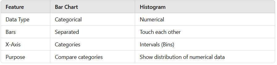
- Bar charts are used for categorical data, while histograms are used for numerical data.
- Bar charts have spaces between bars, while histograms have bars touching because they represent continuous data.
Advantages of Bar Charts
- Easy to read and interpret.
- Can be used to compare multiple categories at once.
- Effective for showing changes over time (if categories represent time periods).
- Useful for both absolute frequency and percentage/proportion data.
Limitations of Bar Charts
- Not suitable for continuous data (use a histogram instead).
- Can be misleading if scales are not chosen correctly.
- Too many categories can make the chart cluttered and difficult to read.