Unit: Exploring One – Variable Data
Chapter: Graphical Representation – Histogram
Reference: – Data type, Frequency Distribution, Measures of center, Measures of spread, Box plots, Scatter plots, Correlation, Regression Analysis, Bar graph & Pie chart, two-way tables & Contingency tables, Probability & Normal Distribution, Confidence Intervals, Hypothesis Testing, Inference for Means & Proportion.
After studying this chapter, you should be able to understand:
- Measures of Graphical tables
- One Variable & Representations.
- Histogram & Graph
Top of Form
Introduction to Histograms
A histogram is a type of graph that represents continuous numerical data by grouping values into intervals (or bins) and displaying the frequency of values within each interval. Unlike bar charts, histograms do not have spaces between the bars because they represent continuous data rather than categorical data.
Histograms are useful for understanding the distribution, shape, spread, and central tendency of a dataset.
Understanding Numerical Data
A histogram is used for quantitative (numerical) data, where values are grouped into intervals. Examples include:
- The ages of students in a school.
- The heights of basketball players.
- The time taken to complete a task.
- The scores obtained by students in a test.
Since numerical data can have a wide range of values, it is grouped into intervals (bins) to make interpretation easier.
Key Characteristics of a Histogram
- Bars Touch Each Other
- Since the data is continuous, bars are adjacent, with no gaps.
- X-Axis Represents Bins (Intervals)
- The X-axis represents different ranges of values rather than categories.
- Example: Age groups 10-15, 16-20, 21-25, etc.
- Y-Axis Represents Frequency
- The Y-axis shows the frequency (how many data points fall within each bin).
- Uniform Bin Size
- Each bin (interval) should have equal width to ensure accurate representation.
Types of Histograms
Histograms can take different shapes depending on the data distribution:
1. Normal Distribution (Bell-Shaped Histogram)
- The data is symmetrical, with most values clustered around the mean.
- Example: Heights of adults in a population.
2. Skewed Right (Positively Skewed Histogram)
- The tail extends towards the right (higher values).
- Example: Salaries in a company (a few employees earn very high salaries).
3. Skewed Left (Negatively Skewed Histogram)
- The tail extends towards the left (lower values).
- Example: Scores in an easy test where most students score high marks.
4. Uniform Distribution (Flat Histogram)
- All bins have roughly equal frequencies.
- Example: Rolling a fair die multiple time.
5. Bimodal Distribution (Two Peaks)
- The histogram has two peaks, indicating two groups in the data.
- Example: Test scores from two different classes.
Steps to Create a Histogram
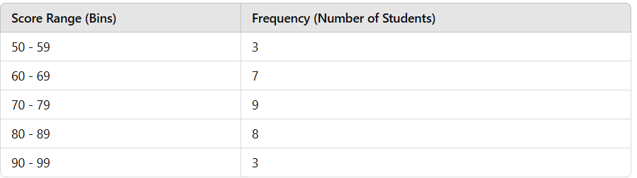
Let’s consider an example where a teacher records the exam scores of 30 students:
Dataset:
55, 62, 71, 85, 90, 88, 75, 80, 78, 91, 67, 58, 95, 60, 77, 83, 92, 79, 68, 72, 89, 65, 87, 73, 81, 66, 76, 84, 69, 70
Step 1: Organize the Data into Intervals (Bins)
To create a histogram, we group the scores into equal intervals:
Step 2: Draw the Axes
- X-axis: Represents the score ranges (50-59, 60-69, etc.).
- Y-axis: Represents the frequency of students in each range.
Step 3: Draw Bars for Each Bin
- Each bin is represented by a bar.
- The height of each bar corresponds to the frequency of values in that range.
Interpreting a Histogram
A histogram helps in understanding the distribution of data:
- Find the Most Common Interval
- The tallest bar represents the interval with the highest frequency.
- In our example, the 70-79 range has the most students (9).
- Check for Skewness
- If the histogram is symmetrical, the data follows a normal distribution.
- If it is skewed right, higher values are less frequent.
- If it is skewed left, lower values are less frequent.
- Identify Outliers
- If a bin has a very low frequency compared to others, it may indicate outliers.
- Compare Spread
- The wider the distribution, the more spread out the data is.
- The narrower the distribution, the more concentrated the data is around the mean.
Histogram vs. Bar Chart
While histograms and bar charts may look similar, they have key differences:
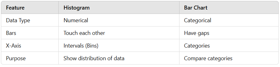
Histograms are used for numerical data, while bar charts are used for categorical data.
Histograms have bars touching, whereas bar charts have spaces between bars.
Advantages of Histograms
- Helps visualize distribution patterns.
Identifies skewness and outliers in data.
Shows frequency of data within specified intervals.
Easy to compare different datasets using uniform bin sizes.
Limitations of Histograms
Choosing the wrong bin size can misrepresent data.
Difficult to compare exact values, unlike bar charts.
Less useful for small datasets with few data points.