Unit: Data Handling and Analysis
Chapter: Introduction to Graph
Reference: – Understanding Graphs and Their Importance, Types of Graphs and Their Uses, Components of a Graph, Plotting Points on a Coordinate Plane, Interpreting Graphs and Drawing Conclusions, Understanding the Scale and Interval of a Graph, Comparing Different Types of Graphs, Identifying Misleading Graphs and Common Graphing Errors
After studying this chapter, you should be able to understand:
- Understanding Graphs and Their Importance
- Components of a Graph & Plotting Points on a Coordinate Plane
- Comparing Different Types of Graphs
- Identifying Misleading Graphs and Common Graphing Errors
1. Understanding Graphs and Their Importance
- Graphs serve as a powerful tool for representing data visually, making it easier to identify patterns and relationships.
- They simplify complex data by providing a clear and structured format for analysis.
- Visualizing data using graphs allows for quick comparisons and helps in decision-making.
- Different types of graphs are used in various fields such as business, science, and economics to analyse trends.
2. Types of Graphs and Their Uses
- Different graphs serve different purposes based on the nature of the data being represented.
- Bar graphs are used to compare categories by displaying rectangular bars, making it easier to differentiate between data sets.
- Line graphs show trends over time, helping in identifying increases, decreases, and patterns in data.
- Pie charts provide a proportional view of data, useful for understanding percentage distributions.
- Histograms are used for frequency distribution, showing how often data values occur within certain intervals.
3. Components of a Graph
- Every graph consists of essential elements that contribute to accurate data interpretation.
- The axes (horizontal and vertical) define the structure of the graph and represent different variables.
- The scale determines the spacing of values along the axes, ensuring clarity and proportionality.
- Labels and titles provide context by specifying what the graph represents.
- A legend is often included to differentiate multiple data sets within the same graph.
4. Plotting Points on a Coordinate Plane
- The Cartesian coordinate system provides a structured way to represent data using horizontal and vertical axes.
- Ordered pairs indicate specific points on the graph, allowing relationships between variables to be visualized.
- The coordinate plane is divided into quadrants, each representing different sign combinations of numerical values.
- Graphing points systematically enables the study of relationships in functions, geometry, and algebra.
5. Interpreting Graphs and Drawing Conclusions
- Understanding graphs involves analysing trends, identifying patterns, and making logical inferences.
- A graph may show a steady increase, a decline, or a fluctuating trend, indicating various real-world scenarios.
- Analysing the shape and direction of a graph helps in predicting future trends and making informed decisions.
- Comparing multiple graphs provides deeper insights into relationships between different sets of data.
6. Understanding the Scale and Interval of a Graph
- The scale of a graph determines how data is spaced along the axes, influencing readability and accuracy.
- Choosing an appropriate interval is crucial to prevent distortion and misinterpretation of data.
- A well-defined scale ensures that small differences in values are noticeable, aiding precise analysis.
- Misuse of scaling can lead to misleading conclusions, affecting the integrity of data presentation.
7. Comparing Different Types of Graphs
- Different types of graphs serve unique purposes based on the nature of data representation.
- Bar graphs are ideal for categorical comparisons, whereas line graphs effectively display trends over time.
- Pie charts are best suited for percentage distributions but may become ineffective for complex datasets.
- Understanding the strengths and weaknesses of each graph type helps in selecting the most appropriate format for data analysis.
8. Identifying Misleading Graphs and Common Graphing Errors
- Misleading graphs often distort data by altering the scale, omitting important details, or using improper visual techniques.
- A graph that lacks a clear title, labels, or proportional representation can result in misinterpretation.
- Intentional manipulation of data visualization can lead to biased conclusions in fields such as marketing and politics.
- Recognizing and avoiding these errors ensures accuracy, reliability, and ethical presentation of information.
Example: –
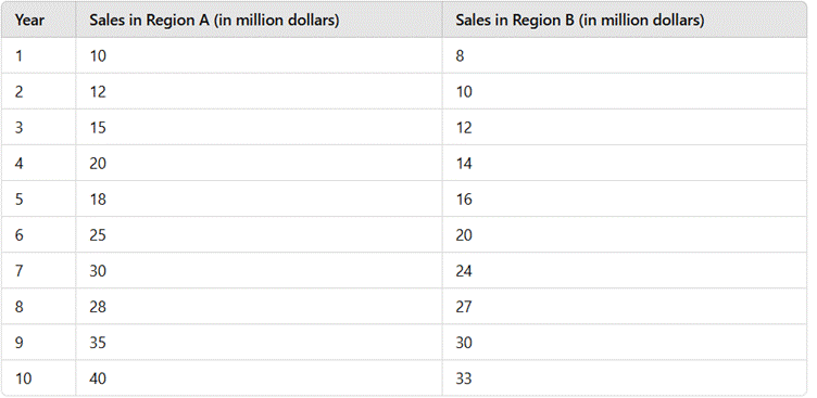
A company is analysing its sales data from the past 10 years to understand trends, make future predictions, and compare regional performance. The company collected the following data:
- Sales (in million dollars) for Region A: 10, 12, 15, 20, 18, 25, 30, 28, 35, 40
- Sales (in million dollars) for Region B: 8, 10, 12, 14, 16, 20, 24, 27, 30, 33
Tasks:
- Plot the sales data on a line graph, ensuring appropriate scaling, intervals, and axis labelling.
- Identify trends and explain which region performed better over time.
- Compare the line graph with a bar graph of the same data and discuss which is more effective in showing trends.
- Critically evaluate potential misleading elements in graphing, such as distorted scales.
- Use the graph to predict the sales for the next two years based on observed trends.
Solution: –
Given Data:
The company tracks sales data for Region A and Region B over 10 years-
Step 1: Plot the Sales Data on a Line Graph
- X-axis: Represents the year (1 to 10).
- Y-axis: Represents sales in million dollars.
- Plot points for both regions as ordered pairs (Year, Sales). Example:
- Region A: (1,10), (2,12), (3,15), etc.
- Region B: (1,8), (2,10), (3,12), etc.
- Draw smooth lines connecting the points for each region.
- Legend: Use different colours or line styles to distinguish Region A and Region B.
Step 2: Identify Trends & Explain Performance
- Region A's growth pattern: Sales increased steadily with minor fluctuations (Year 5 to 6 showed a dip).
- Region B’s growth pattern: Sales also increased but at a slightly slower rate.
- Which region performed better?
- Region A started higher and ended higher (40 million in Year 10 vs. 33 million for Region B).
- Region A experienced faster growth in later years.
- Region B had more steady growth, whereas Region A had fluctuations.
Step 3: Compare Line Graph vs. Bar Graph
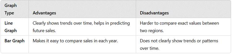
Which is better for this case?
- The line graph is more useful because we are analyzing trends.
- The bar graph would be better if we were just comparing total sales per year.
Step 4: Identifying Misleading Graphs
- Scaling Issues:
- If the Y-axis does not start from zero, it might exaggerate small differences.
- Uneven intervals on the Y-axis can misrepresent the growth.
- Visual Manipulation:
- Using 3D effects or unequal bar widths can distort perception.
- Omitting key data points can alter conclusions.
Step 5: Predicting Sales for the Next 2 Years
Observing the Growth Rate:
- Region A: Sales increased by an average of 3-5 million per year.
- Region B: Sales increased by an average of 2-3 million per year.
Final Conclusion:
- Line graphs help track trends, while bar graphs are useful for comparisons.
- Region A had higher growth and is projected to remain ahead.
- Proper scaling is crucial to avoid misleading representations.
- Graphs can be used to forecast future trends and guide business decisions.
Here are five conclusive points summarizing the chapter "Introduction to Graphs"
1. Graphs Provide a Clear and Organized Representation of Data
- Graphs transform complex numerical data into a visual format that is easier to interpret.
- They help in identifying patterns, trends, and relationships between different variables.
- A well-constructed graph enhances understanding by simplifying large data sets into meaningful insights.
2. Different Types of Graphs Serve Different Purposes
- Various types of graphs, such as bar graphs, line graphs, and pie charts, are used based on the nature of the data.
- Selecting the right type of graph ensures accurate representation and prevents misinterpretation of information.
- Each type of graph highlights specific aspects of data, such as comparison, distribution, or trend analysis.
3. Proper Scaling and Labelling Are Essential for Accuracy
- A graph must have a well-defined scale to ensure that data is represented proportionally and clearly.
- Titles, axis labels, and legends provide context, making it easier to understand the information being conveyed.
- Misuse of scaling or improper labelling can lead to misleading conclusions and errors in data interpretation.
4. Graphs Help in Analysing and Predicting Trends
- By observing patterns in graphical data, one can predict future trends and outcomes in various fields such as economics, science, and business.
- Graphs are widely used in forecasting, decision-making, and statistical analysis.
- A well-analysed graph provides valuable insights that can influence strategic planning and problem-solving.
5. Identifying and Avoiding Misleading Graphs is Crucial
- Some graphs may be intentionally or unintentionally designed to misrepresent data by altering scales, omitting key details, or exaggerating differences.
- Being able to recognize misleading visual representations helps in making informed and unbiased conclusions.
- Ethical and accurate graphing practices ensure integrity and reliability in data communication.