Unit: Data Handling and Analysis
Chapter: Organizing Data
Reference: – Understanding the Importance of Organizing Data, Types of Data and Their Classification, Data Collection Methods and Recording Techniques, Organizing Data Using Tables and Frequency Distributions, Sorting and Arranging Data for Better Interpretation, Grouping Data into Intervals (Binning), Understanding Data Representation Methods
After studying this chapter, you should be able to understand:
- Understanding the Importance of Organizing Data
- Data Collection Methods and Recording Techniques
- Organizing Data Using Tables and Frequency Distributions
- Understanding Data Representation Methods
1. Understanding the Importance of Organizing Data
- Data organization plays a crucial role in simplifying large and complex datasets for effective analysis.
- It helps in identifying meaningful patterns, relationships, and trends that might otherwise be difficult to observe.
- Well-organized data enhances decision-making by providing structured information for further statistical analysis.
- Organized data reduces errors, eliminates redundancy, and allows for efficient retrieval of information.
2. Types of Data and Their Classification
- Data is broadly categorized into qualitative (categorical) and quantitative (numerical) types, depending on its nature and usage.
- Qualitative data represents characteristics or attributes that are descriptive rather than measurable, such as colours or labels.
- Quantitative data includes numerical values that can be counted or measured, and is further classified into discrete and continuous data.
- Data can also be classified based on its source into primary data (collected firsthand) and secondary data (obtained from existing records).
3. Data Collection Methods and Recording Techniques
- The process of collecting data must be structured and systematic to ensure reliability and accuracy.
- Common methods of data collection include surveys, interviews, observations, and experiments.
- Recording data efficiently involves maintaining tables, lists, or digital spreadsheets that allow for easy access and analysis.
- Ethical considerations must be followed to ensure the integrity and confidentiality of collected data.
4. Organizing Data Using Tables and Frequency Distributions
- Data is often arranged in tables to provide clarity and ease of interpretation.
- A frequency table helps summarize data by showing how often each category or value appears in a dataset.
- Organizing data in tabular form ensures structured representation, which is useful in statistical and graphical analysis.
- The use of cumulative frequency helps understand the distribution of data across different intervals.
5. Sorting and Arranging Data for Better Interpretation
- Sorting data in a specific order, such as ascending or descending, helps in analysing trends and comparisons effectively.
- Arranged data allows for quick identification of the highest and lowest values within a dataset.
- Systematic organization of data aids in computing statistical measures like median and mode with greater accuracy.
- Recognizing patterns in sorted data helps in forecasting and making logical inferences.
6. Grouping Data into Intervals (Binning)
- Large datasets can be categorized into intervals or groups to make analysis more manageable.
- Binning helps in understanding the distribution of data by clustering values into defined ranges.
- The selection of interval size should be appropriate to prevent loss of important variations in the data.
- Grouped data representation is essential for statistical tools like histograms and frequency polygons.
7. Understanding Data Representation Methods
- Various graphical and tabular methods are used to represent organized data effectively.
- Bar graphs, histograms, pie charts, and line graphs serve different purposes in data visualization.
- Selecting the appropriate representation method depends on the type and complexity of the data.
- Well-structured data representation enhances comprehension and supports data-driven conclusions.
8. Identifying Outliers and Their Impact on Data Analysis
- Outliers are values that deviate significantly from the general pattern of a dataset.
- These extreme values can distort statistical measures, leading to inaccurate conclusions.
- Detecting and analysing outliers is important in understanding anomalies or errors in data collection.
- Proper treatment of outliers ensures that data analysis remains relevant and meaningful.
Example: –
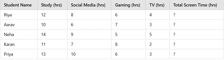
A school conducted a survey among students to analyse their weekly screen time (in hours) spent on different activities. The collected data is presented in the table below:
Tasks:
- Calculate the total screen time for each student.
- Classify the data into qualitative and quantitative categories.
- Sort students based on their total screen time in descending order.
- Represent the data visually using a bar graph or pie chart.
- Identify if any outliers exist in the dataset and discuss their impact.
Solution: –
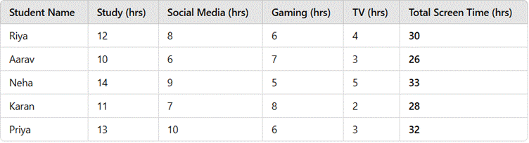
Step 1: Calculate the Total Screen Time for Each Student
The total screen time is calculated as:
Total Screen Time=Study + social media + Gaming + TV
Step 2: Classify the Data into Qualitative and Quantitative Categories
- Qualitative (Categorical) Data: Student Name
- Quantitative (Numerical) Data: Study Hours, Social Media Hours, Gaming Hours, TV Hours, Total Screen Time
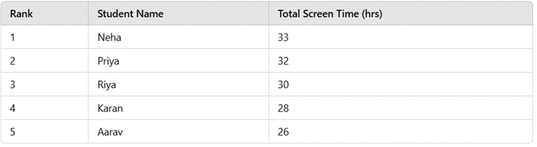
Step 3: Sort Students in Descending Order of Total Screen Time
Step 4: Visual Representation of Data
- Bar Graph Representation: A bar graph can be used where the x-axis represents student names, and the y-axis represents total screen time in hours. Each student's total screen time is plotted as a bar.
- Pie Chart Representation: A pie chart can show the percentage of each student’s total screen time relative to the overall total.
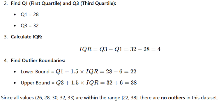
Step 5: Identify Outliers
To check for outliers, we use the Interquartile Range (IQR) Method:
- Arrange total screen time in ascending order:
26,28,30,32,33
Final Conclusion:
- Neha has the highest total screen time (33 hours).
- Aarav has the lowest total screen time (26 hours).
- The data is well-distributed with no significant outliers.
- A bar graph or pie chart would be the best way to visually represent this data.
Here are five conclusive points summarizing the chapter "Organizing Data"
1. Organized Data Enhances Clarity and Interpretation
- Properly arranged data simplifies complex information, making it easier to analyse and interpret.
- A structured format allows for efficient identification of patterns, relationships, and trends.
- Well-organized data is essential for making informed decisions and accurate predictions.
2. Classification of Data Helps in Effective Analysis
- Data is categorized based on its nature, such as qualitative (descriptive) or quantitative (numerical).
- Understanding different types of data ensures the correct application of statistical methods.
- Proper classification enhances the ability to compare, contrast, and evaluate datasets.
3. Graphical and Tabular Representations Improve Data Communication
- Using tables, charts, and graphs provides a visual summary of data, making it more accessible.
- Different types of visual representations, such as bar graphs and histograms, highlight distinct aspects of the data.
- Well-designed data representations prevent misinterpretation and support logical conclusions.
4. Grouping Data into Intervals Provides Better Insights
- Binning large datasets into intervals simplifies analysis and prevents data overload.
- Frequency distributions help in understanding the spread and concentration of data points.
- Proper interval selection ensures meaningful representation without loss of critical information.
5. Identifying Outliers is Crucial for Accuracy in Analysis
- Outliers can significantly affect statistical measures like mean and median.
- Detecting and addressing anomalies helps maintain the reliability of data-driven conclusions.
- A thorough analysis of outliers provides insights into potential data errors or unexpected trends.